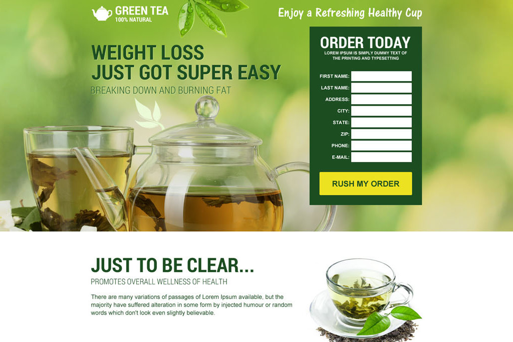
One of the biggest trouble we all face is stripping down the landing page to the extent that there is no navigation at all. Most people think that clicking to call is one of the best buttons in the landing page which will allow a lot of conversions rather than a lot of distractions.
We all might be thinking about how do designers know the best action to take when it comes to landing page design.
It’s always important to keep the landing page simple which will reduce a lot of distractions. If at all you keep the navigation too complicated the customer will just leave the page and go away.
One of the main reasons why discussion even today takes place about landing pages is because many websites today have a set of navigation bars. As per the study, 16% of the landing pages are free from navigation which is due to a loss of conversion chances.
Most of the designers who make use of a navigation bar in their landing page are not in search of clients. If any of your customers tell you to have a navigation bar on the landing page do educate him.
Inform him that taking our navigation from the landing page will rather increase the conversion rate. The client might not easily believe you or even provide various reasons as he would need a logo, and branding to push the site up. You have to give him some tips and suggestions that will slowly convince him to remove the navigation.
- Minders which is a childminding website has increased its conversion rate after they removed the navigation from their landing page. They have a 90% change in their website after taking this step.
- Yuppie Chef has also removed their navigation bar on the landing page which has increased their conversion rate by 100%.
The next step you need to do after the navigation menu is stock images. We all tend to make use of a lot of stock images which actually fail to provide trust in the landing page.
Always keep it a habit of using real images in the landing page which will make the customer automatically click through your website. Placing the images on the top of the landing page headline as these headlines are been read by most of the viewers.
The more people read headlines they will start going deep inside the site to know the real story behind it.

Once your images are in their place you need to have a call to action button which will give a perfect flow to the page. This is one of the most important and hardest things that will make your landing page perfect.
You need to keep it in such a manner that the visitor does not have any problem clicking it and communicating with you. Below are the things you need to consider when it comes to the call to action button.
- Keep the colour attractive so that visitors easily find it and click it.
- The size needs to be proper not too big and not too small.
- The direction button will be very good for the visitor to use it in the best ways.
Try to keep minimum links rather than just using countless links on the landing page. This will provide you high conversion rate and give you a very good landing page.
Once you remove the navigation you will come across various other links which need to be removed to keep the landing page clean. The best and smartest way to make all the important links unnoticeable.
All the major links that are seen on the page will allow your clients to get proper navigation and leads. This will give you a great chance of conversion.
The designer should always keep the consumers’ needs and interests in mind and accordingly make the landing page. As per stud,y it says that customer always wants things simple and to the point.
If you give them too many options they get confused and decide to go with some other company. Hence it’s important to keep the landing page simple because if the client sees too many links and options on the landing page itself he will fail to gain your confidence and just keep going to some other website that is in the same field but made in a very persisted and best way for the client.
Always keep your client in mind and see to it that you don’t fill up the landing page with too many things like links, stock images and a lot of content. Use the best things that you think will attract your clients easily. It will automatically increase your conversion rate and provide you twith he best results as expected.


