Responsive web design serves in effectively blending the best features of both fixed as well as liquid layouts so that all types of screen sizes can be accommodated successfully. The website is designed in such a manner that it is able to respond to the basic dimensions such as the breadth and length of the screen.
As a result, the layout of that particular page of the website is adjusted to fit the viewable portion. The utility of a responsive web design is not merely limited to web layouts. Rather it gives you the liberty to create web pages without taking into account the viewable area.
Overcoming the difficulties of existing layouts
When it comes to the world of web designing, fixed layouts have been ruling the roost for quite some time. In such cases the layout of the web pages remains the same, irrespective of the dimensions of the area that is viewable. In order to overcome its disadvantages for web surfing, liquid layouts started gaining popularity over the last few years. Such layouts are excellent options for smaller devices such as mobiles, since they have the flexibility to adapt itself according to the dimensions of the browser window. However in case of a larger screen, the web content might appear overstretched or sparse for viewing. A responsive web design is necessary for balancing such shortcomings so that the website can be viewed from any device, big or small.
Some practical advantages
Responsive web designs have become a bare necessity these days with people accessing the internet using multiple different sorts of devices starting from traditional desktops to tablet computers to sleek, handy smartphones. In the present scenario, websites need to be optimized in such a manner that they can be viewed at equal ease from a PC as well as a cell phone. For instance, due to space crunch, it is always commendable to place the main menu in the form of a vertical sequence rather than going the horizontal way. And this is rendered possible only by a responsive web design.
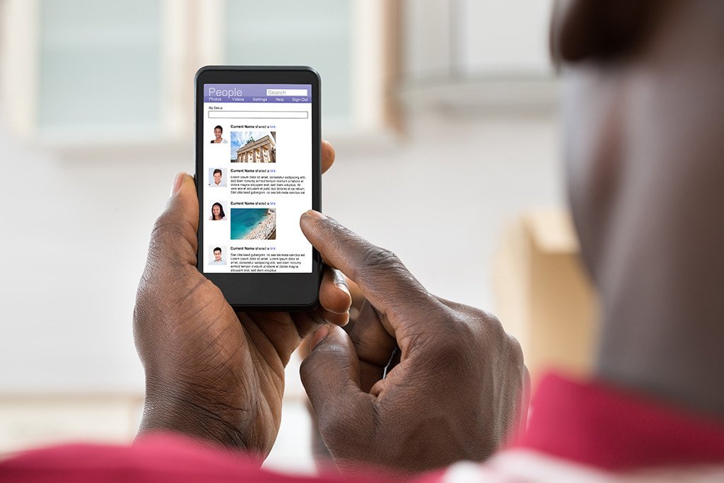
Catering to various screen sizes
A responsive web design is undoubtedly the best cure for those tiny loopholes that some websites seem suffer from. The website might be perfect for use by a person working on a larger screen as in case of a laptop or a PC, but the same website might give a tough time to another user accessing it by means of an iPad or an iPhone due to the contracted display area. Forms that are filled up online often contain side bar regions that appear to be so small on the screen of your mobile phone that it is quite impossible to read the text. Using a responsive web design, the size of the form can be readily modified for fullest clarity even on your small screen.
Improving your performance
The moment you opt for a responsive design for your website, your visibility index in the search engines and traffic will automatically increase since your website will be easily accessible to the innumerable smartphone and tablet users out there. Besides getting an extra edge in this competitive market, you will end up saving the time and costs of constructing a separate mobile-friendly website to reach out to a section of potential clients.